I. Background
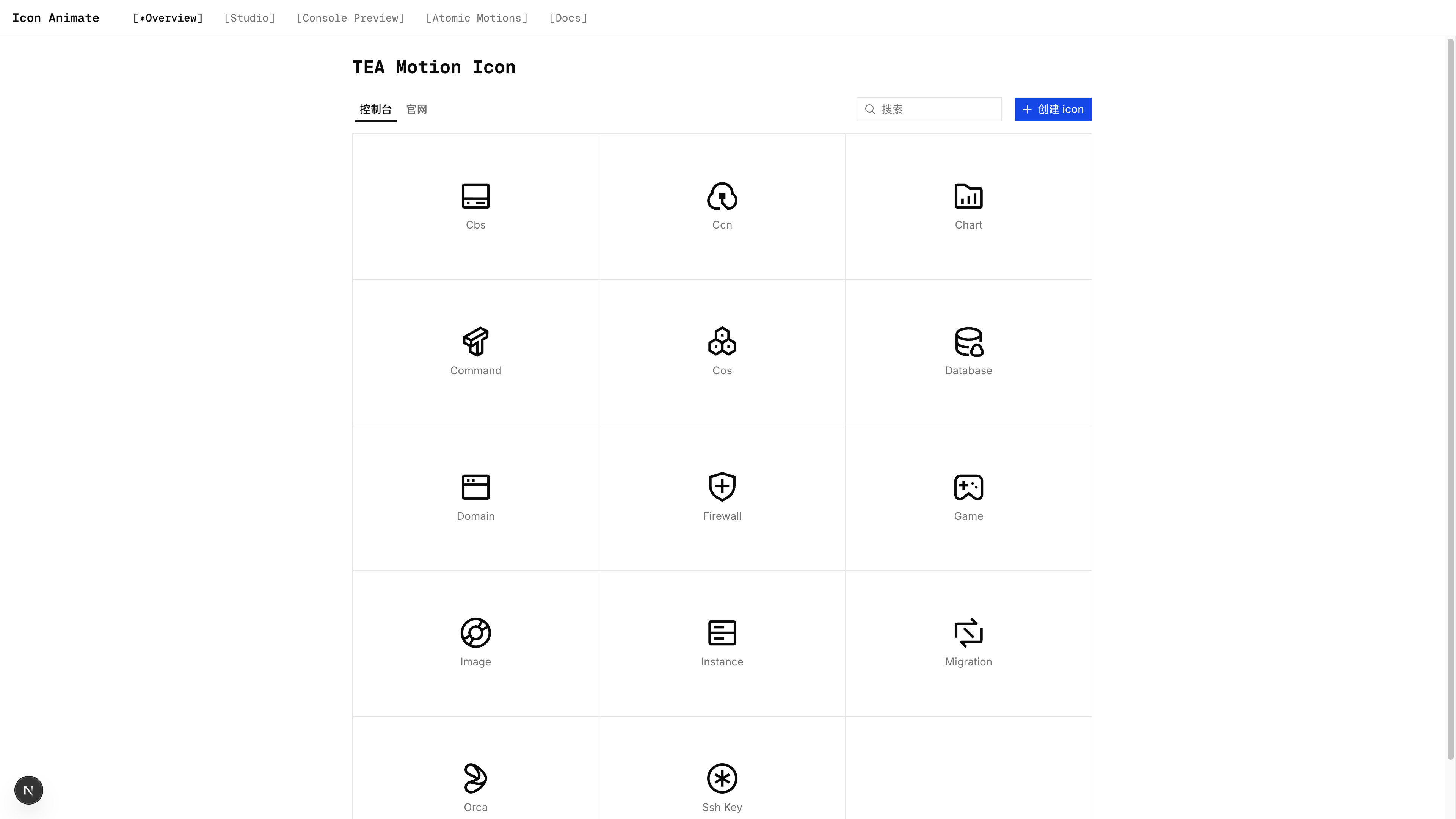
During an upgrade to our platform framework, the team added hover motion to sidebar icons. The framework covers about 200 cloud products and more than 2,000 icons.
Creating every animation in After Effects would be expensive and make consistency difficult to maintain.
We therefore needed a system that could generate motion at scale, enforce shared constraints, and still allow manual adjustment. AI could assist with generation, but it needed a stable motion system underneath it.
II. Technology Evaluation
I first compared three common approaches:
| Solution | Pros | Cons |
|---|---|---|
| GIF | Good compatibility, WYSIWYG | Large file size, fixed resolution, difficult dark-mode adaptation, no interactive control |
| Lottie | Rich animations, supports complex paths | Requires JSON file + lottie-web (~60KB), separate from CSS ecosystem, rendering overhead |
| CSS | Vector lossless, small footprint, no JS runtime, integrates with Tailwind | Limited expressive power for complex animations |
Sidebar icons usually require only translation, scaling, rotation, and occasional 3D transforms. CSS covers most of these effects. Lottie would require JSON assets and a runtime across 2,000 icons, while GIF would not adapt cleanly to dark mode. CSS was therefore the most appropriate option.
III. Atomic CSS Animations
3.1 Atomization
Choosing CSS did not solve the volume problem. Writing Keyframes and Animation declarations for 2,000 icons would still require the same amount of manual work.
Tailwind CSS provides a useful model: divide motion into small units and let designers compose them. If interfaces can be built with flex, p-4, and text-sm, motion can be described with utilities such as scale-75 and rotate-12.
This model also suits AI. Selecting from a constrained set of motion primitives is more stable than generating Keyframes from scratch and makes consistency easier to control.
I used tailwindcss-motion, an atomic motion library for Tailwind v3, as the starting point.
tailwindcss-motion already defines a useful motion taxonomy and set of values. However, its Tailwind v3 JS plugin architecture (matchUtilities + addBase) cannot be used directly in Tailwind v4's CSS-based system. I used Claude Code to rewrite it with Tailwind v4 @utility rules and CSS Variables, then adjusted it for SVG icons.
Additions:
- Stroke (draw): An animation type not present in tailwindcss-motion. It achieves line drawing/growth via
stroke-dashoffset, requiring SVG elements to havepathLength="1". Three slots were extended:draw-in,draw-out, anddraw-loop.
The stroke animation sets
stroke-dasharrayto1.1, rather than exactly1, and givesstroke-dashoffsetan initial value of0.05. When the Dasharray equals the path length, subpixel rendering near the boundary can cause a slight flicker. Extending the path beyond that boundary avoids the unstable value.
- Shake: Built-in multi-level decaying oscillation in keyframes (amplitude decays stepwise: -0.5, 0.25, -0.1, 0), reusing the rotate slot without adding new CSS variables.
- Reverse animations: Supports negative prefix syntax, e.g.,
-motion-translate-x-in-50(reverse translation),-motion-draw-in-100(draw from path end in reverse). More intuitive for both AI generation and manual writing. - Trigger mechanism: tailwindcss-motion's animations play automatically when elements mount. This solution adds a
data-motion-triggerattribute system supporting hover and click triggers. When not triggered,animation-name: none !importantcompletely suppresses the animation, with no reliance on JS events. - SVG transform-origin fix: SVG elements default to
transform-origin: 0 0(top-left), while HTML elements default to50% 50%(center). It automatically setstransform-box: fill-boxwithin the[data-motion-icon]scope, ensuring rotation and scaling are centered around the element itself.
Removals:
- Preset system: tailwindcss-motion has 30+ pre-composed animation presets (
motion-preset-fade,motion-preset-slide, etc.). In this solution, this responsibility is handed to AI — the AI composes solutions from atomic parts based on icon semantics, rather than humans selecting from presets. - Filter, text-color, and background-color animations: Not needed in icon animation scenarios, removed directly to reduce slot count and CSS size.
- Loop default changed from
infiniteto 1: Console icon looping animations usually only need a finite number of repetitions (e.g., a gear rotating one or two turns then stopping). Infinite loops require explicitly addingmotion-loop-infinite.
Adjustments:
- Default duration reduced from 700ms to 300ms, better suited for micro-interaction pacing.
- Added spring easing based on
linear()(spring-smooth/snappy/bouncy/bouncier/bounciest), from kvin.me/css-springs. - All
@keyframesare uniformly wrapped in@media (prefers-reduced-motion: no-preference)(tailwindcss-motion only wrapped transform classes; color/opacity classes were not wrapped).
tailwindcss-motion is a general-purpose web motion library. This project retains its slot architecture and adapts it for SVG icons.
The project supports the following effects:
| Effect | Enter | Exit | Loop | Notes |
|---|---|---|---|---|
| Translate | Fly in from top/bottom/left/right | Fly out to top/bottom/left/right | Float up/down/left/right | Supports reverse |
| Scale | Scale from small to large | Scale from large to small | Pulse, breathe effect | Supports single-axis |
| Rotate | Rotate in | Rotate out | Continuous rotation | Supports reverse |
| Shake | Shake in | Shake out | Continuous shake | Damped oscillation |
| Fade | Fade in | Fade out | Blink | — |
| Stroke Draw | Line drawing in | Line erasing | Line breathing | SVG path animation |
The system includes 22 easing curves covering standard Easing, back, spring, and bounce behavior. The default duration is 300ms; delay, loop count, and transform origin remain configurable.
3.2 The Animation Slot Solution in tailwindcss-motion
The slot design in tailwindcss-motion prevents multiple animation utilities from overriding one another.
Writing two animations for an element is easy in native CSS:
.element {
  animation:
    scale-in 0.3s,
    rotate-in 0.3s;
}
When the same effects are composed through utilities (animate-scale-in animate-rotate-in), the later animation declaration replaces the earlier one instead of appending to it.
Entrance and loop motion are more difficult to combine. An element may enter from the left once, then continue moving in place. Because the animation property is replaced as a whole, two independent utility classes cannot express this sequence directly.
3.3 Animation Slots
The library predeclares every slot. Each utility writes only to its corresponding slot while the remaining slots stay none. This uses CSS Variable fallbacks as a form of multiplexing:
| Phase | Slots | Properties |
|---|---|---|
| enter | 1–6 | scale-in, translate-in, rotate-in, opacity-in, bg-color-in, draw-in |
| exit | 7–12 | scale-out, translate-out, rotate-out, opacity-out, bg-color-out, draw-out |
| loop | 13–18 | scale-loop, translate-loop, rotate-loop, opacity-loop, bg-color-loop, draw-loop |
6 properties × 3 phases = 18 slots. The concept is as follows:
@utility motion-translate-x-in-* {
  --motion-translate-in-animation: /* actual animation value */;
  animation:
    /* slot 1-6 (enter) */
    var(--motion-scale-in-animation),
    /* → none */ var(--motion-translate-in-animation); /* → actual animation */
  /* ... remaining 16 slots follow the same pattern */
}
Actual code (Tailwind v4 @utility):
@utility motion-translate-x-in-* {
  --motion-origin-translate-x: --value(
    --motion-translate-*,
    [percentage],
    [length]
  );
  --motion-translate-in-animation: motion-translate-in
    calc(
      var(--motion-translate-duration, var(--motion-duration)) *
        var(--motion-perceptual-duration-multiplier)
    )
    var(--motion-translate-timing, var(--motion-timing))
    var(--motion-translate-delay, var(--motion-delay)) both;

  animation:
    var(--motion-scale-in-animation), var(--motion-translate-in-animation),
    var(--motion-rotate-in-animation), var(--motion-opacity-in-animation),
    var(--motion-background-color-in-animation),
    var(--motion-draw-in-animation), var(--motion-scale-out-animation),
    var(--motion-translate-out-animation), var(--motion-rotate-out-animation),
    var(--motion-opacity-out-animation),
    var(--motion-background-color-out-animation),
    var(--motion-draw-out-animation), var(--motion-scale-loop-animation),
    var(--motion-translate-loop-animation), var(--motion-rotate-loop-animation),
    var(--motion-opacity-loop-animation),
    var(--motion-background-color-loop-animation),
    var(--motion-draw-loop-animation);
}
All utility classes share the same 18-slot animation declaration. When motion-scale-in-75 motion-translate-x-loop-25 are used together, each class only writes values into its own slot without overriding each other.
The loop slots use animation-composition: accumulate, allowing loop animation transforms to accumulate on top of the final state of the entrance animation, rather than starting from zero. This way, elements can complete their entrance animation first, then continue looping from their current position, with both phases transitioning naturally.
3.4 Arbitrary Values
When preset values aren't enough, you can use bracket syntax to specify arbitrary CSS values:
<g class="motion-translate-x-in-[12px] motion-rotate-loop-[30deg]">
  <path d="..." pathLength="1" />
</g>
Tailwind v4's --value() extracts values from class names and maps them directly to CSS variables.
3.5 Accessibility
All keyframes are wrapped in @media (prefers-reduced-motion: no-preference). When users disable animations in system settings, animations automatically become silent.
3.6 Trigger Methods
Currently, sidebar animations are generally hover-triggered. The design principle here is to keep logic in the CSS layer as much as possible. The motion trigger mechanism is implemented via the data-motion-trigger attribute; CSS attribute selectors control animation start/stop states based on the attribute value:
[data-motion-trigger="hover"]:hover {
  --motion-trigger: running;
}
We can place motion-trigger on the outer container, so when hovering a sidebar List item, the inner icon animation can be triggered.
Correspondingly, when used in React, motion-react provides a minimal hook:
import { useHoverMotionTrigger } from "motion-react/hooks";

function MyIcon() {
  const hoverProps = useHoverMotionTrigger<HTMLDivElement>();
  return (
    <div {...hoverProps}>
      <SettingsIcon />
    </div>
  );
}
useHoverMotionTrigger returns a ref and a data-motion-trigger="hover" attribute. CSS handles the remaining behavior, without mouseenter or mouseleave listeners, State changes, or JS animation logic.
Playback and pause are handled by the browser's CSS engine. The interaction does not trigger React re-renders or require JS to calculate animation progress, reducing runtime cost in a system with more than 2,000 icons.
IV. Project Structure
The project is a Monorepo with three parts:
css-motion-system/
├── apps/studio/           # Next.js web application
├── packages/
│   ├── motion/            # Pure CSS animation library
│   └── motion-react/      # React icon components
The dependency relationship is studio → motion-react → motion, one-way with no cycles.
motion has no build step and publishes CSS directly. motion-react uses tsup to bundle ESM, CJS, and type definitions. studio is a local web application for creating icon motion.
V. Web UI Workflow
Studio divides the workflow into four steps. AI produces an initial result; the designer evaluates and adjusts it.
Step 1: Upload SVG. Import a file through drag and drop.
Step 2: SVGO optimization and semantic grouping. SVGO removes redundant nodes, normalizes attribute order, and adds pathLength="1" to Paths. Gemini 3.1 Flash then analyzes the SVG source and rendered image to suggest groups. For example, a gear can be divided into “outer teeth” and “center hole”:
<svg viewBox="0 0 24 24">
  <g data-group="outer teeth">
    <path d="..." />
  </g>
  <g data-group="center hole">
    <circle ... />
  </g>
</svg>
The editor supports overlay comparison, displays groups in different colors, and allows manual restructuring.
Step 3: Generate a motion plan. Designers can select the motion type, duration, easing curve, and loop count with a live preview.
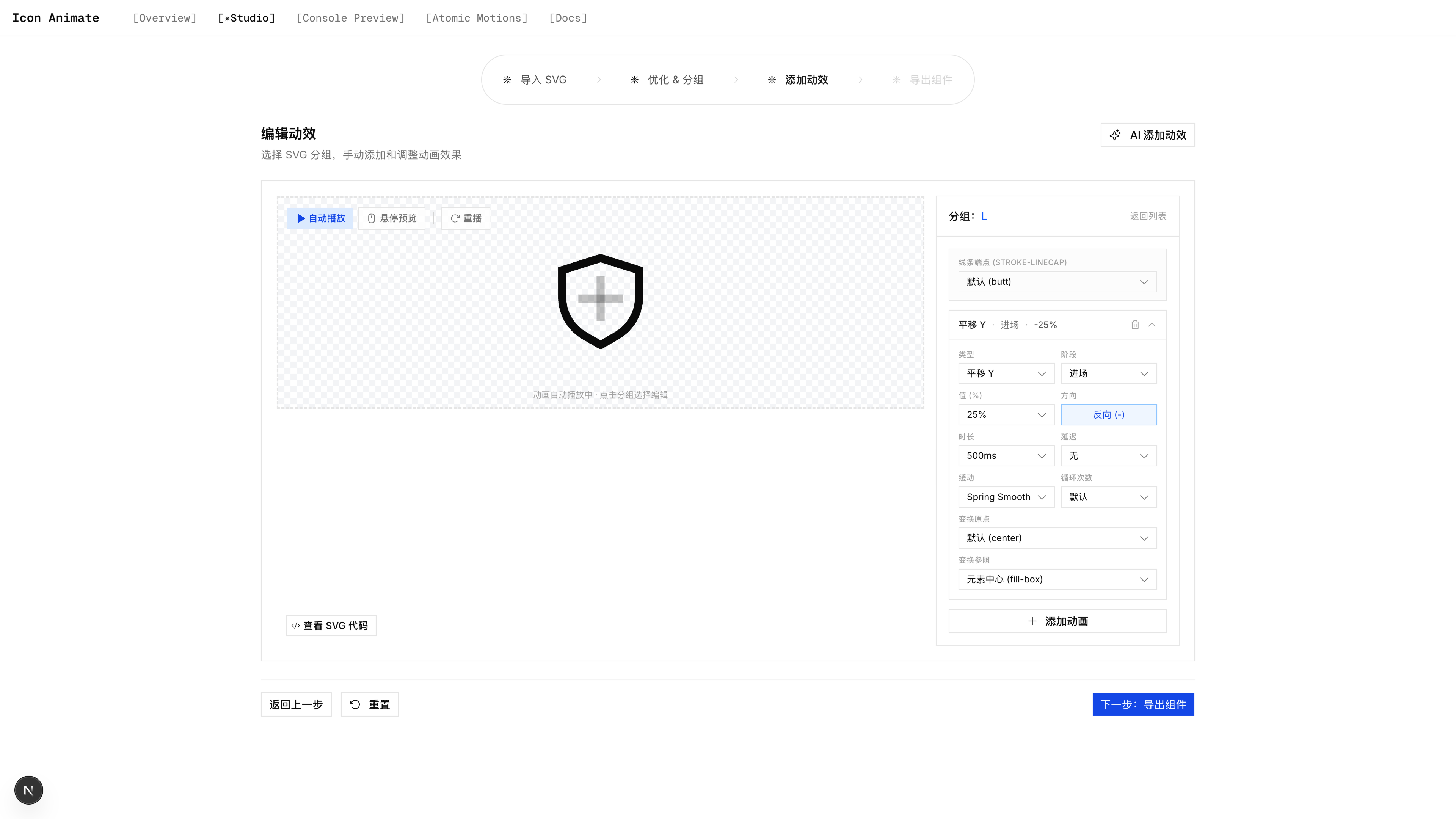
AI can also generate three plans from the icon's semantics. For a gear:
- Plan A: Outer teeth rotate slowly (loop), center hole fades in (in)
- Plan B: Entire icon slides in from the left (translate-in), rotates 90° (rotate-in)
- Plan C: Stroke drawing growth (draw-in), with slight scale bounce (scale-in + spring-bouncy)
After selecting a plan, the designer can still adjust its type, duration, easing, and loop count.
Step 4: Export. Two formats are available:
- React TSX component with types,
size/strokeWidthprops - Standalone SVG with embedded CSS, usable in non-React scenarios
TSX files can be written directly to the motion-react source directory and published to npm after the build.
VI. Skill
The workflow is also packaged as a Skill. Through natural language, users can provide an SVG, run SVGO, group its paths, generate and adjust plans, produce TSX, and write the result to the component package.
Sub-agents can process several icons in parallel from SVG code provided in the terminal.
The Skill is suited to batch generation; the GUI is suited to adjusting individual icons.
VII. Summary
The system has four parts:
- Atomic SVG motion based on the slot architecture in
tailwindcss-motion - A
motion-reactlibrary with React icon components and Hooks - A Studio Web UI for AI generation and manual adjustment
- A Skill that exposes the same workflow through natural language
The system is currently used for the company website and several product sidebars. An experienced designer can complete motion for about 15 sidebar icons in one day, approximately 20 times faster than the previous workflow.
VIII. Acknowledgments
Thanks to romboHQ for tailwindcss-motion, and to Tailwind CSS for the atomic model.