This article draws on my design work at startups and large companies. It focuses on web products; mobile teams may use it as a reference.
Why Do You Need a Design System?
A design system is often understood as a complex Figma component library with complete documentation. For a startup, its more practical form is code: reusable CSS variables, components, and styles.
A team can operate for a while without polished Figma files or extensive documentation, but it still needs code that can be shipped. The role of a design system is to establish a minimum level of consistency so that the product does not gradually lose coherence as it evolves.
What Does a Startup Need?
Based on my work at Zeabur and Tencent, a minimum viable design system only needs to cover a few foundations.
Color: The Foundation
Color affects visual consistency, development efficiency, and accessibility. Once a palette is used across the product, changing it touches many components and pages. Its basic structure should therefore be established early.
Zeabur's previous color system did not support light mode well, provided limited text readability, and was difficult to extend. Replacing it took substantial work. The lesson was not that a palette must be complete from the start, but that it must leave room for change.
A color system needs to answer several questions:
- Brand expression: How does color reflect the product and relate to its logo and overall character?
- Naming: Should colors use semantic names such as
$colorPrimaryand$colorError, or primitive scales such asblue-500andgray-900? Primitive scales are often easier to extend and reuse across themes. - Colors and steps: How many colors and steps are currently required? Will new steps need to be inserted later? Neutral colors often require more levels because they serve backgrounds and text at several depths.
- Themes: How should Light Mode and Dark Mode be organized? Will customer-specific brand themes be required?
- Accessibility: Do foreground and background combinations meet WCAG or another relevant standard?
The value of the color system is not the number of tokens it defines. It is the amount of cascading change it prevents later.
Corner Radius and Icons: A Consistent Silhouette
Corner radius and icons jointly shape the product's silhouette. Component corners should have a similar visual tendency to the endpoints and turns used in the icon set.
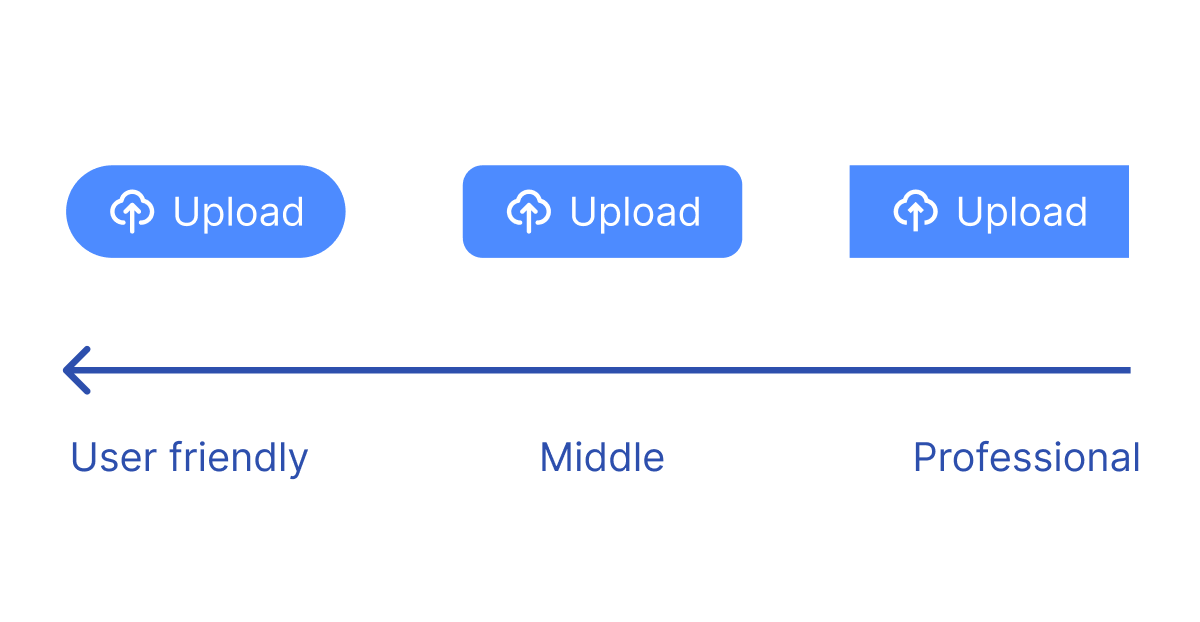
- Corner radius: Larger radii tend to feel softer; smaller radii and square corners feel more restrained. The exact choice matters less than using a stable set of rules.
- Icons: Early in the project, choose one consistent open-source library, such as Lucide, Feather Icons, or Tabler Icons. Avoid mixing icons from unrelated sources.
Basic Controls: Core Interaction
A startup does not need to implement a component set as broad as Ant Design or Material Design. A small group of high-frequency controls can cover 70%–80% of common cases. Linear's approach provides a useful reference.
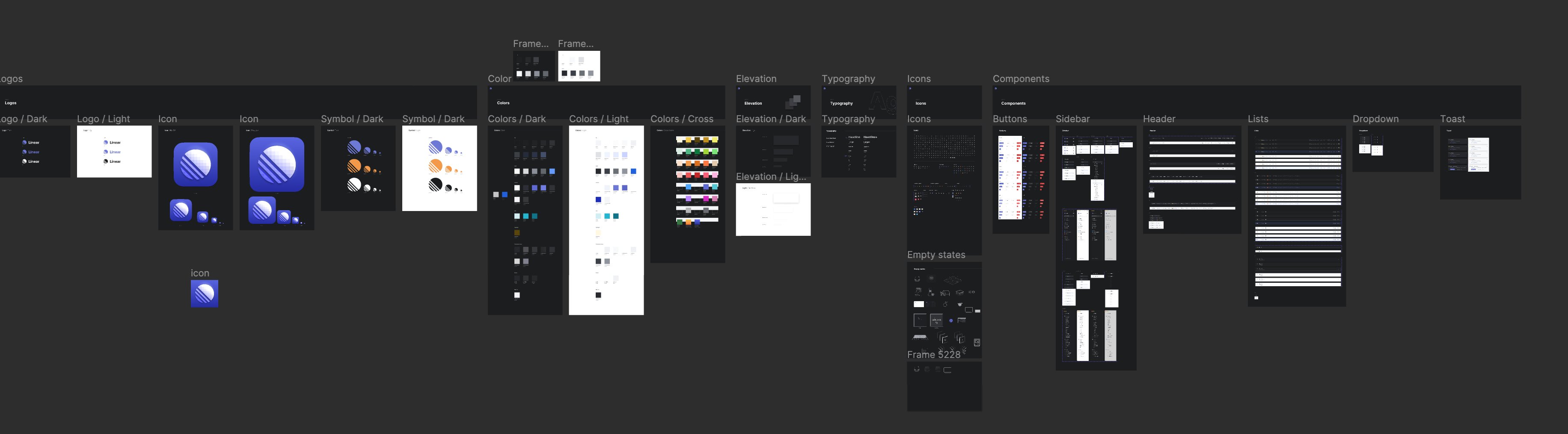
The initial set usually includes:
- Buttons: Primary, Secondary, Ghost, and the sizes the product needs
- Inputs: Input and Textarea
- Selection controls: Checkbox, Radio Button, and Switch
- Feedback: Modal, Dialog, Notification, and Toast
- Components used frequently by the product itself
These controls carry most direct interaction. Resolve their states, feedback, and accessibility before expanding the component count.
Typography and Spacing: Information Hierarchy
The initial typography system can remain small. It should distinguish at least three roles:
- Heading: Page and section titles. Start with one or two levels, such as
20pxBold. - Body: Paragraphs, descriptions, and regular content, such as
14pxRegular. - Subtle / Secondary: Placeholders, hints, and disabled states. It may use the same size as Body with lower visual emphasis.
As the information hierarchy grows, add H1, H2, and H3; distinguish Body Large from Body Small; and introduce functional styles such as Link, Caption, and Button Text.
Spacing can begin with a base unit such as 8px, followed by a scale of 8px, 16px, 24px, and 32px. The purpose is to reduce arbitrary values so designers and engineers do not repeatedly decide between 10px and 12px.
Motion (Optional)
An initial motion system only needs to define duration and easing. The goal is to give different components a consistent feedback rhythm.
- Duration
- Fast:
100ms–150msfor hover states, icon highlights, and immediate feedback - Medium:
200ms–300msfor card expansion, collapse, and modal appearance - Slow:
400ms–500msfor larger regions such as sidebars
- Fast:
- Easing
- Standard: One general curve for most interface transitions
- Emphasis: A distinct curve for the few changes that require more attention; it can be omitted initially
Additional Guidance
- Start in code: Establish color variables and basic components in the codebase, then iterate.
- Avoid premature coverage: Build only the Figma styles and components that the product currently uses. Do not enumerate every possible variant.
- Abstract repeated patterns: Add a pattern to the system after it appears repeatedly in the product.
For a startup, a design system is not a project to complete. It is infrastructure for reducing repeated decisions and inconsistent delivery. Its purpose is to help the team ship more quickly and consistently.