The Limits of RGB and HSL
RGB and HSL
RGB is an additive model composed of red, green, and blue light. It is also the basis for displaying color on screens. In CSS, it is usually written as rgb(r, g, b) or a hexadecimal value such as #RRGGBB.
RGB is efficient for devices but difficult for people to adjust directly. Changing R, G, and B values does not make the resulting lightness, saturation, or hue easy to predict. RGB is also not perceptually uniform: the same numerical difference can produce different levels of visual change in different parts of the space. Traditional RGB is usually bounded by sRGB and cannot represent every color available on modern wide-gamut displays.
HSL organizes color through Hue, Saturation, and Lightness. It can be understood as a cylindrical transformation of RGB:
- H (Hue): The basic color tendency, expressed as an angle from 0 to 360 degrees.
- S (Saturation): The intensity of the color, expressed from 0% to 100%.
- L (Lightness): Its position between black and white, also expressed from 0% to 100%.
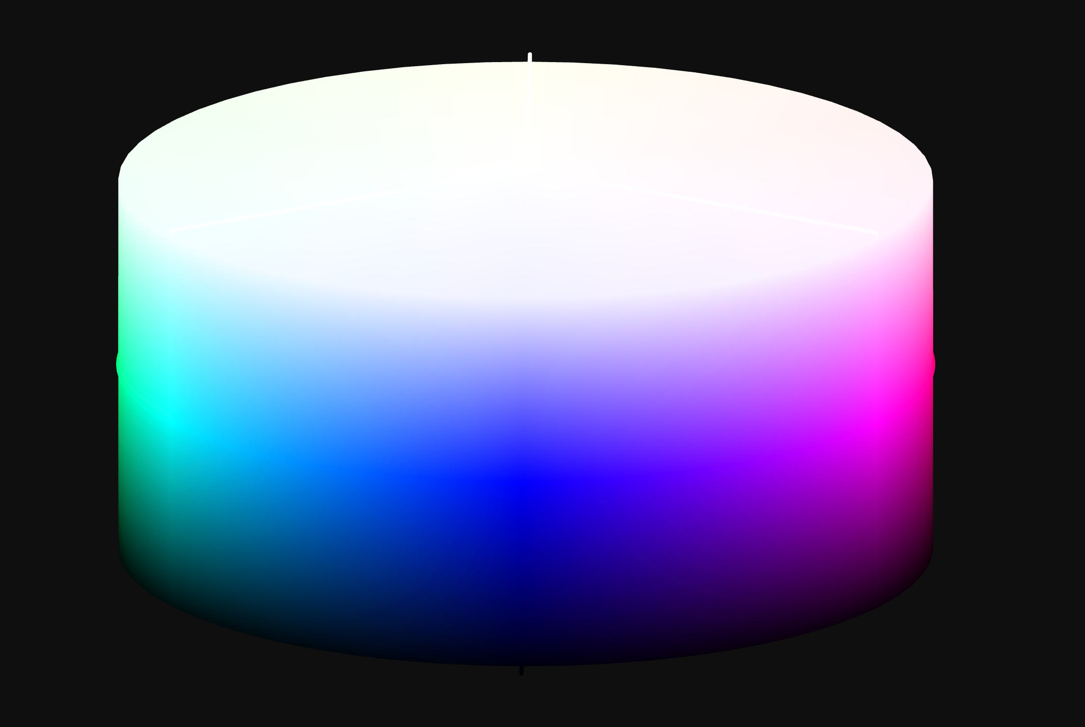
HSL is easier to read than RGB, but its L does not represent perceived lightness. It is derived directly from RGB values and does not fully account for the eye's different sensitivity to different wavelengths. At the same L of 50%, hsl(60, 100%, 50%) appears substantially brighter than hsl(240, 100%, 50%).
HSL's L therefore cannot standardize the perceived lightness of different hues. Increasing L by 10% across several colors also produces different visual changes. This limits its usefulness for building scales, controlling contrast, and deriving related colors.

The Shared Problem
RGB, HSL, and HSV are all perceptually non-uniform. Simple arithmetic on their parameters does not reliably produce smooth lightness scales or balanced palettes. In HSL, for example, fixing L and S while changing H creates noticeable jumps in perceived brightness.
The same limitation affects accessibility. If a lightness parameter does not reflect perceived lightness, it cannot serve as a reliable contrast measure. HSL remains useful as a readable representation, but it is a weak foundation for systematic color derivation.
Perceptually Uniform Color Spaces
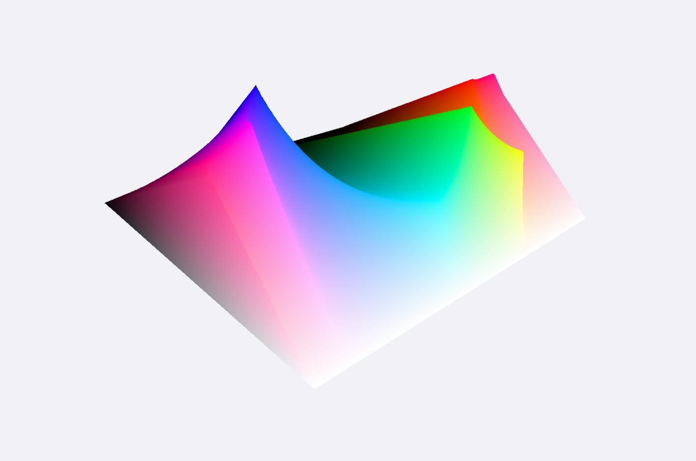
A perceptually uniform color space attempts to make numerical distance correspond roughly to perceived difference. Equal adjustments to a parameter should produce similar visual changes across the space.
This provides several practical benefits:
- Predictability: Parameter changes more closely match visual changes.
- Consistency: Palettes and gradients are easier to keep smooth, with fewer gray regions and unexpected hue shifts than direct sRGB interpolation.
- Design application: Rules can control palettes and hierarchy more reliably.
- Accessibility: A more reliable lightness parameter provides a basis for contrast decisions. Stripe, for example, used CIELAB L* when building its accessible color system.
CIELAB (Lab) and LCh are established perceptually uniform spaces used in print and industrial color control. CIELAB contains L* (perceived lightness), a* (red–green), and b* (yellow–blue). LCh is its cylindrical form, with L*, C* (chroma), and h (hue angle).
Perceptual uniformity does not replace visual judgment. It allows color systems to rely more on rules and less on repeated manual correction, which is useful for multiple themes, light and dark modes, and accessibility requirements.
OKLCH
What is OKLCH?
Oklab and its polar form, OKLCH, were proposed by Björn Ottosson in 2020. They address perceptual irregularities in CIELAB, particularly in some hue ranges, while remaining practical for computation and digital display. See A perceptual color space for image processing for the technical details.
Compared with CIELAB/LCH, Oklab/OKLCH improves hue linearity and uniformity. Reducing the chroma of a blue, for example, moves it toward gray with less unintended drift toward purple or green.
OKLCH has three main components:
- L (Lightness): Usually ranges from 0 to 1, corresponding to black and white.
- C (Chroma): Starts at 0 and generally becomes more vivid as it increases. Its practical limit in sRGB is about 0.37 and can be higher in Display P3.
- H (Hue): An angle from 0 to 360 degrees.
The color may also include Alpha transparency.
Why Choose OKLCH?
Its main benefits are:
- Perceptual uniformity: Changes in L are closer to perceived changes, and hue behavior is more uniform than CIE LCH.
- Predictable derivation: L, C, and H are relatively independent. Fixing H and C while changing L creates a lightness scale; fixing L and C while changing H creates a multicolor set with more consistent perceived weight.
- Wide-gamut support: OKLCH can represent Display P3 and other gamuts wider than sRGB.
- Accessibility foundation: A more reliable L helps organize contrast, although final combinations still need to be tested against the relevant accessibility standard.
- Readability:
oklch(0.7 0.15 200)communicates more of the color's structure thanrgb(128, 177, 207)or#80B1CF.

CSS Support
OKLCH is part of the W3C CSS Color specification and Baseline 2023 Newly Available.
CSS Color Module Level 4 introduced oklch() and oklab(). Relative color syntax and color-mix() extend their use in color derivation and interpolation.
-
Relative Color Syntax: Read channels from a source color and create a variant, such as
oklch(from var(--brand-blue) calc(l * 0.8) c h).:root { --color-btn: oklch(45% 0.3 266); } .btn { padding: 12px; background-color: var(--color-btn); border: none; cursor: pointer; color: white; } .btn:hover { background-color: oklch(from var(--color-btn) calc(l + 0.2) c h); }

-
color-mix(): Mix colors in a specified space. Interpolating in OKLCH usually reduces the loss of saturation and unintended hue shifts common in sRGB mixing..container-1 { background-color: color-mix(in oklch, yellow, blue); width: 20rem; height: 2rem; } .container-2 { margin-top: 1rem; background-color: color-mix(in srgb, yellow, blue); width: 20rem; height: 2rem; }
Linear, Stripe, and Tailwind CSS are among the products and teams using OKLCH or related perceptually uniform methods in their color systems.
Limitations
Several issues still require separate handling.
Gamut Mapping and Out-of-Gamut Colors
OKLCH can define colors outside a device's gamut. Displaying them in a narrower space such as sRGB requires gamut mapping. Mapping in OKLCH can preserve relative lightness and hue more effectively than direct clipping, but browsers and tools may still produce different results.
Browser Implementations
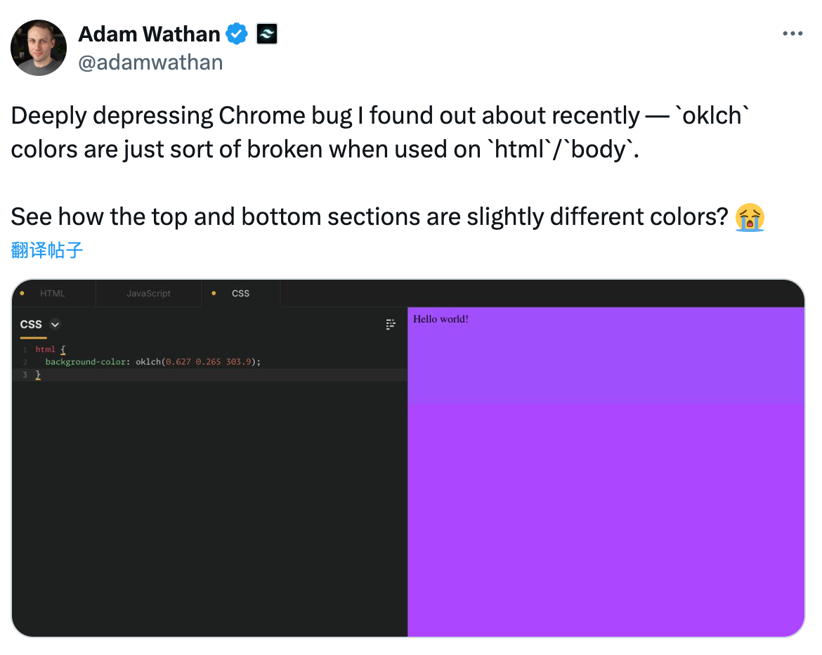
Early browser implementations had rendering problems around boundary values and some conversions. Major browsers have resolved most basic compatibility issues, but extreme values and complex gamut conversions still need cross-environment testing.
Design Tool Support
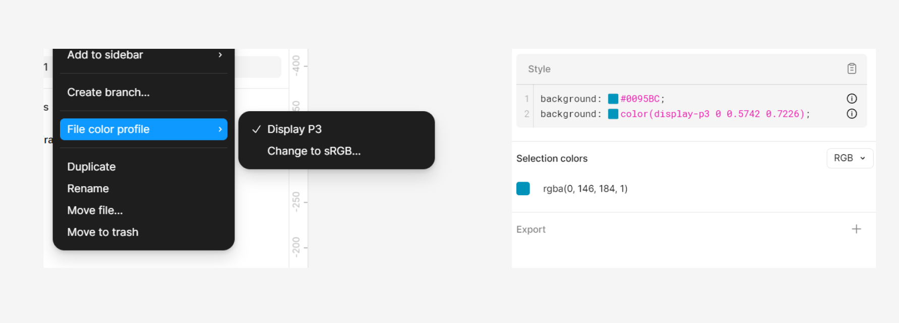
Web support is relatively mature, but design-tool workflows remain inconsistent. Figma can display wider colors in P3 files and plugins can assist with OKLCH, but conversion to and from traditional formats still adds cost.
Building a Palette with OKLCH
The following example uses Huetone to create a palette with Brand, Success, Warn, and Error colors. Similar tools include:
- https://huetone.ardov.me/
- https://uicolors.app/
- https://oklch.com/
- https://harmonizer-web.web.app/
- https://github.com/dokozero/okcolor
- https://m3.material.io/blog/material-theme-builder
Choose an Output Strategy
A project can use either of two approaches:
- Use it directly: Use CSS
oklch()in production and retain relative colors, mixing, and wide-gamut output. Tailwind CSS 4 follows this approach. Products that still support older browsers need a compatibility strategy. - Convert the output: Design the palette in OKLCH, then export RGB or HEX. Compatibility is more stable, but converting wide-gamut colors to sRGB can alter colors with high chroma.
This example uses the second approach: build the palette in OKLCH, then export a traditional format.
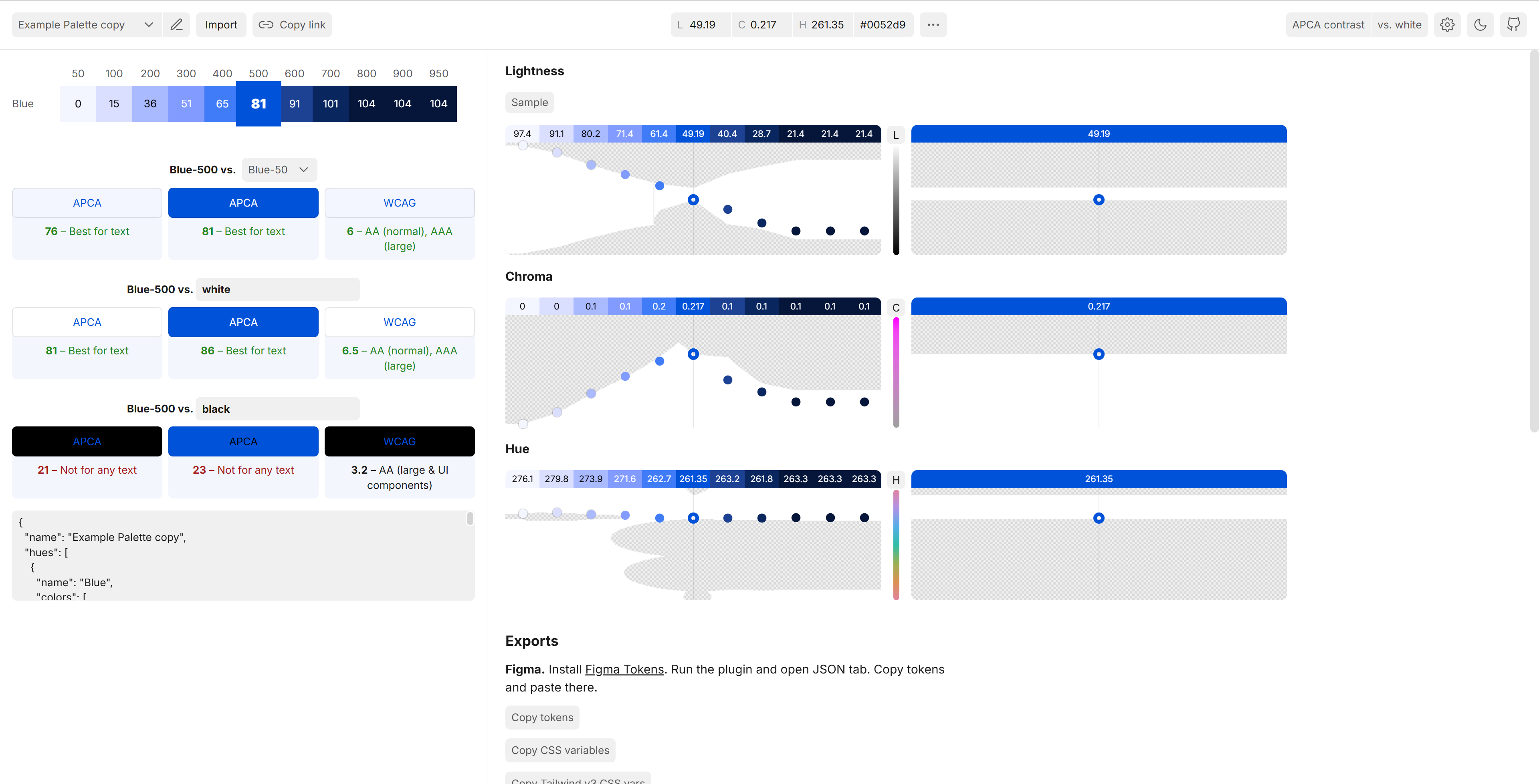
Step 1: Brand Color Palette
Brand color is usually determined during visual identity work. The design-system designer should participate early enough to evaluate accessibility and room for extension in digital products. This example starts with #0052d9.
Next, choose the number of steps. Ten to twelve usually cover most cases; neutral gray may require more levels.
The scale can follow Tailwind CSS and use 50, 100, 200, ..., 900, 950. Unlike 1–9, this sequence leaves room to insert values between existing steps. Primitive and Semantic Token mapping is outside the scope of this article.
The Base Color often sits at 500 or 600, with lighter and darker steps extending from it. Its position is not fixed; it depends on its L, C, H, and intended use.
In Huetone, remove the other example colors, keep one row, add 900 and 950, and place #0052d9 at 500.
Select Apply Hue to the Row so every step uses the same H. Then adjust the L distribution manually or generate an initial sample with a linear or Cubic function.
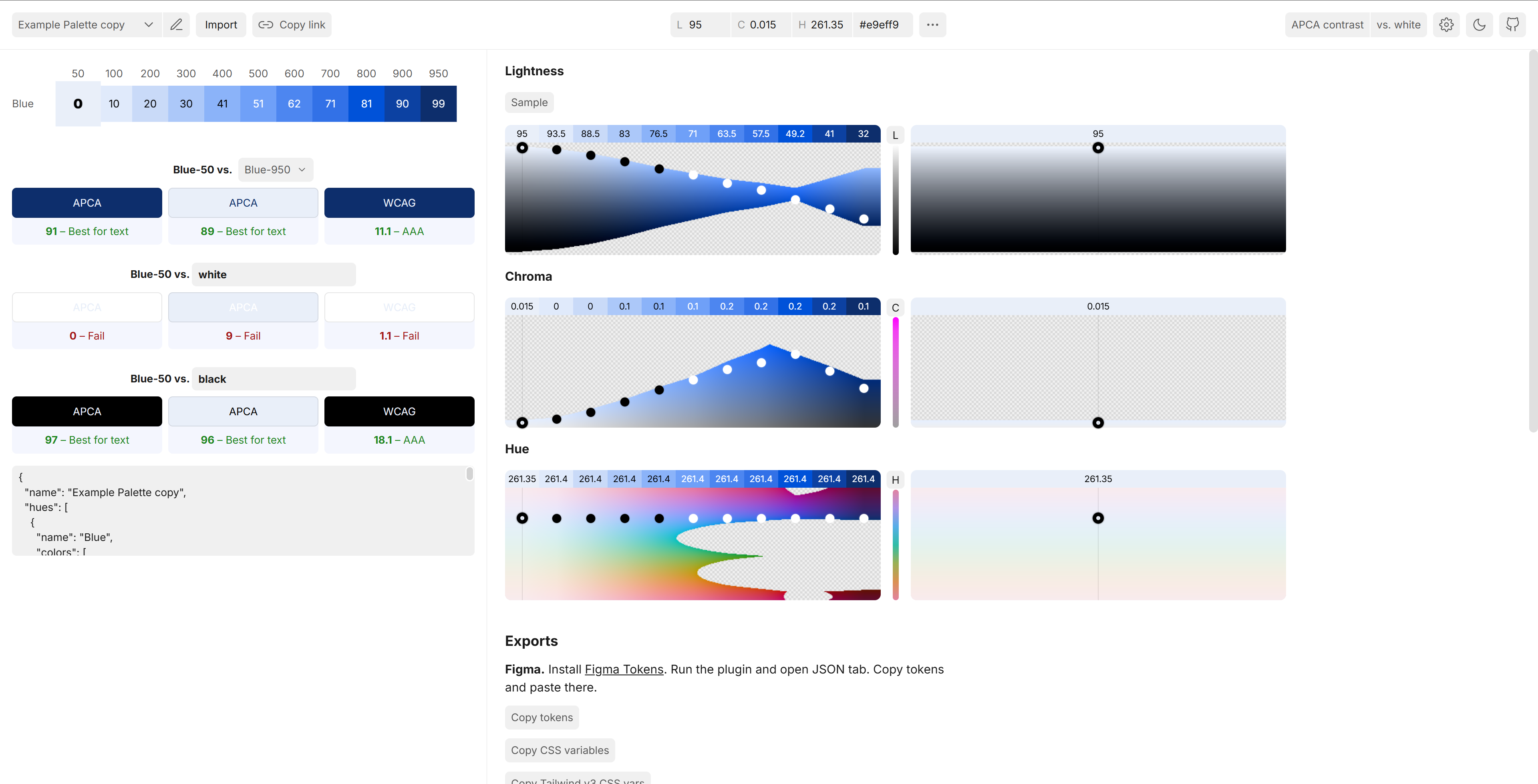
If the brand color already has high APCA contrast against white, placing it at 500 may leave too little room for darker steps. #0052d9, for example, may fit better at 800. The Base Color does not need to be the midpoint. If one palette cannot serve both light and dark themes, maintain separate palettes, as Radix Colors does.
After moving the brand color to 800, adjust L and C. In this example, the Base Color has the highest C, which decreases toward both ends so the other steps remain secondary.
Step 2: Applying to Other Colors
Once the L and C curves are established, use Huetone's Copy Last Row to create initial Success, Warn, and Error palettes. The new row inherits L and C at every step.
Adjust H at the main step, here 800, to define the semantic color. A green H can represent Success. C usually needs a smaller adjustment to remain inside sRGB and preserve the relationship between palettes.
After setting H and C, use Apply Current Hue to Row to generate the scale. Repeat the process for Warn and Error.
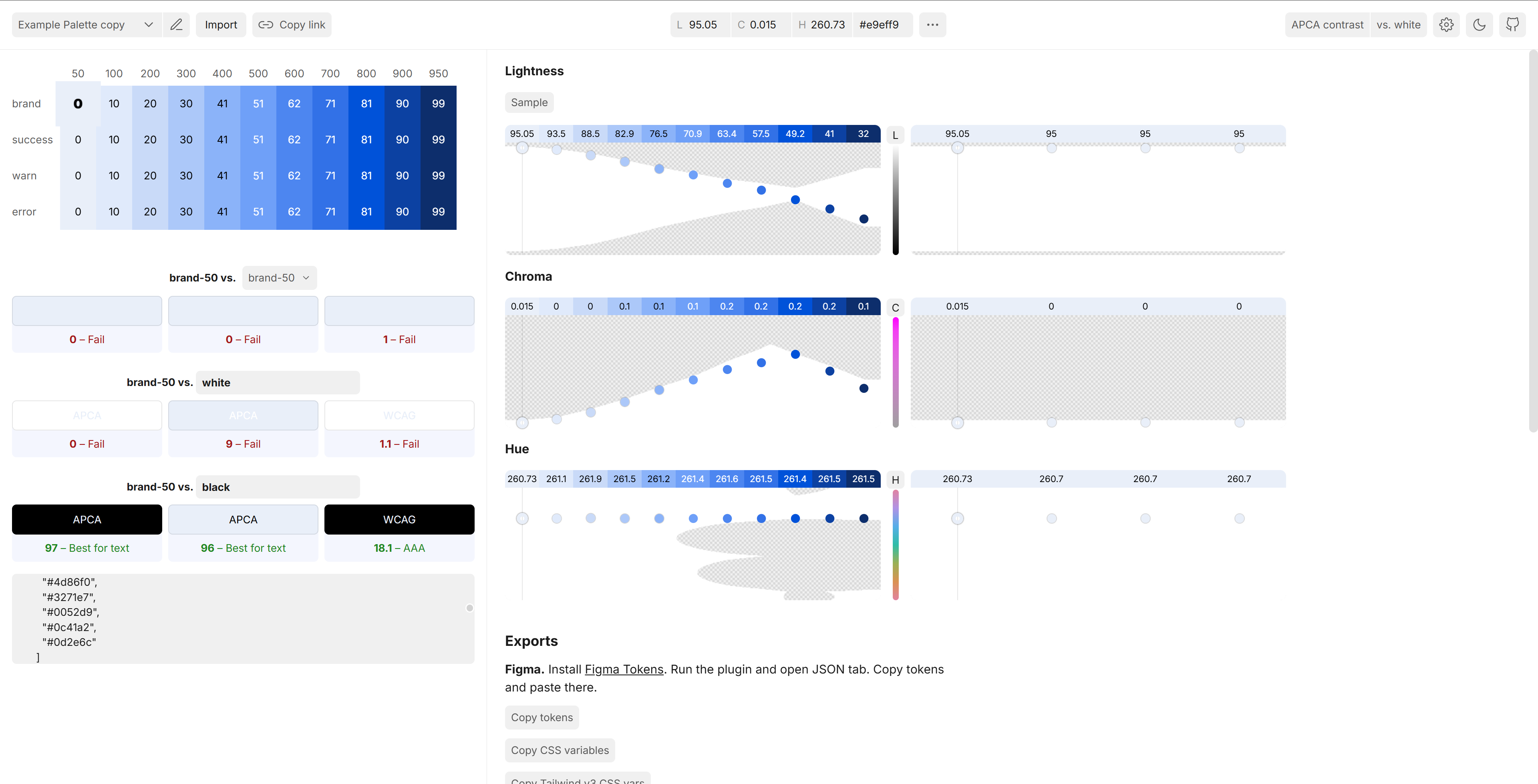
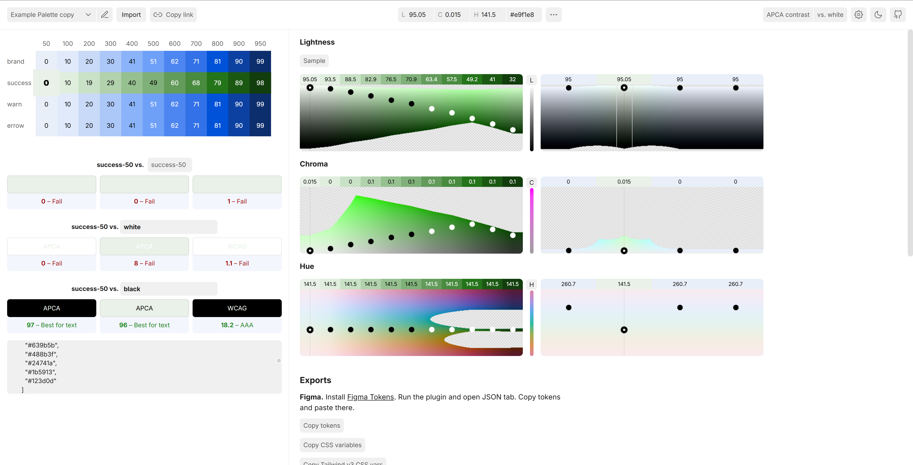
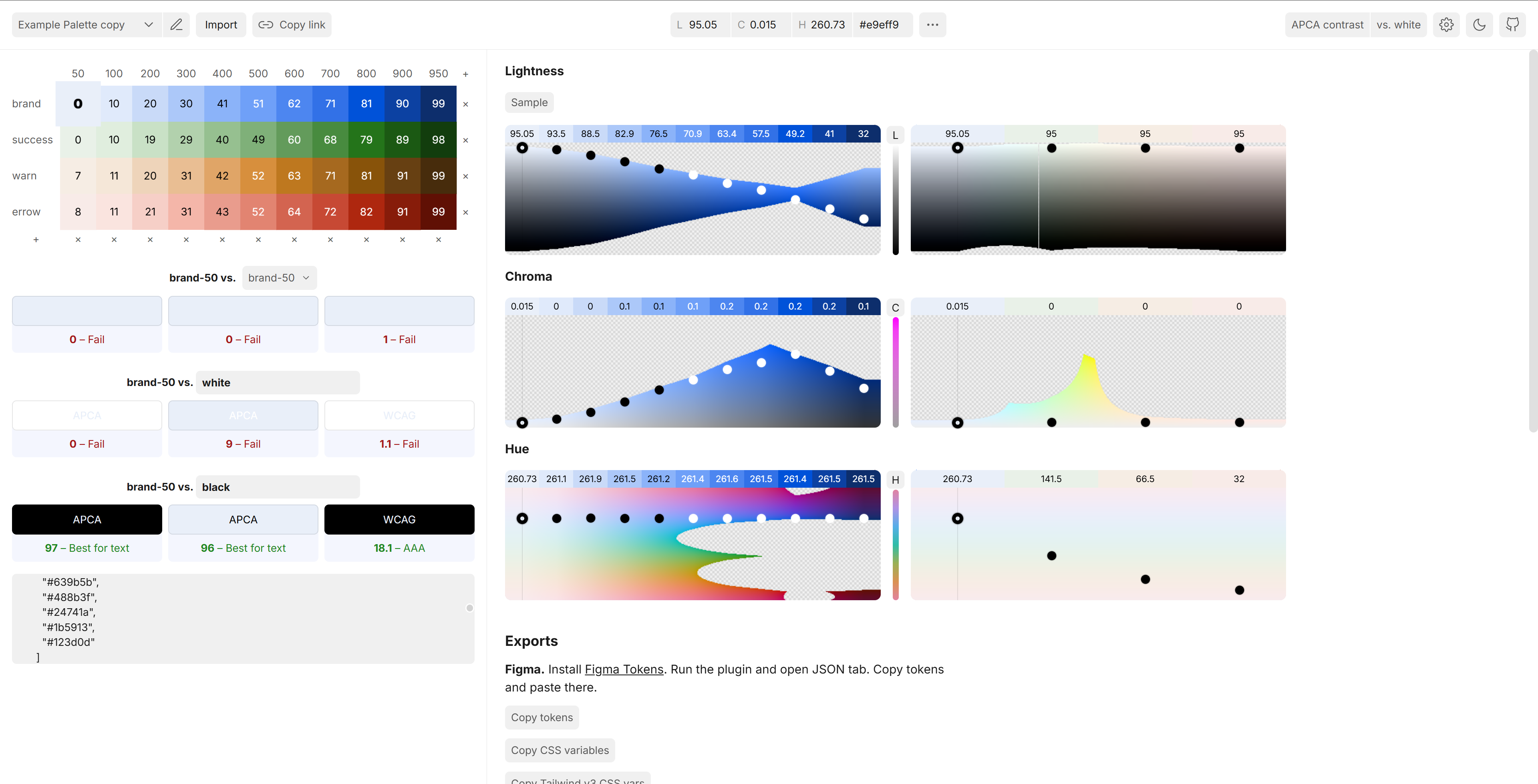
This produces the initial palette structure. OKLCH and generation tools reduce adjustment cost, but they do not replace visual judgment. Gamut, distinction between adjacent steps, and combinations in real interfaces still require manual review.
Step 3: Iterate, Test, and Export
Place the initial palette back into real interfaces. Use APCA or WCAG to test foreground and background contrast, and observe combinations across displays and lighting conditions.
Design, product, and engineering should agree on semantic use, implementation, and compatibility. A palette is not an isolated visual artifact; it needs to work inside components and themes.
After validation, export the palette as CSS Custom Properties, JSON, or the format required by the design tool.
/* Example Palette copy color palette */

/* brand */
--brand-50: #e9eff9;
--brand-100: #e0eafb;
--brand-200: #c9daf8;
--brand-300: #acc8f9;
--brand-400: #8bb3f9;
--brand-500: #6fa0f8;
--brand-600: #4d86f0;
--brand-700: #3271e7;
--brand-800: #0052d9;
--brand-900: #0c41a2;
--brand-950: #0d2e6c;

/* success */
--success-50: #e9f1e8;
--success-100: #e0eede;
--success-200: #c9e1c6;
--success-300: #b2d1ad;
--success-400: #96c090;
--success-500: #7fb079;
--success-600: #639b5b;
--success-700: #488b3f;
--success-800: #24741a;
--success-900: #1b5913;
--success-950: #123d0d;

/* warn */
--warn-50: #f6ede4;
--warn-100: #f5e7d8;
--warn-200: #eed4ba;
--warn-300: #e9be93;
--warn-400: #e0a567;
--warn-500: #d78f3d;
--warn-600: #be781f;
--warn-700: #a6691f;
--warn-800: #88530a;
--warn-900: #674012;
--warn-950: #472c0c;

/* error */
--error-50: #f8ebe8;
--error-100: #fae4df;
--error-200: #f6cfc7;
--error-300: #f4b6a9;
--error-400: #e99c8d;
--error-500: #e28471;
--error-600: #d36450;
--error-700: #c74934;
--error-800: #ae270f;
--error-900: #871c0a;
--error-950: #601004;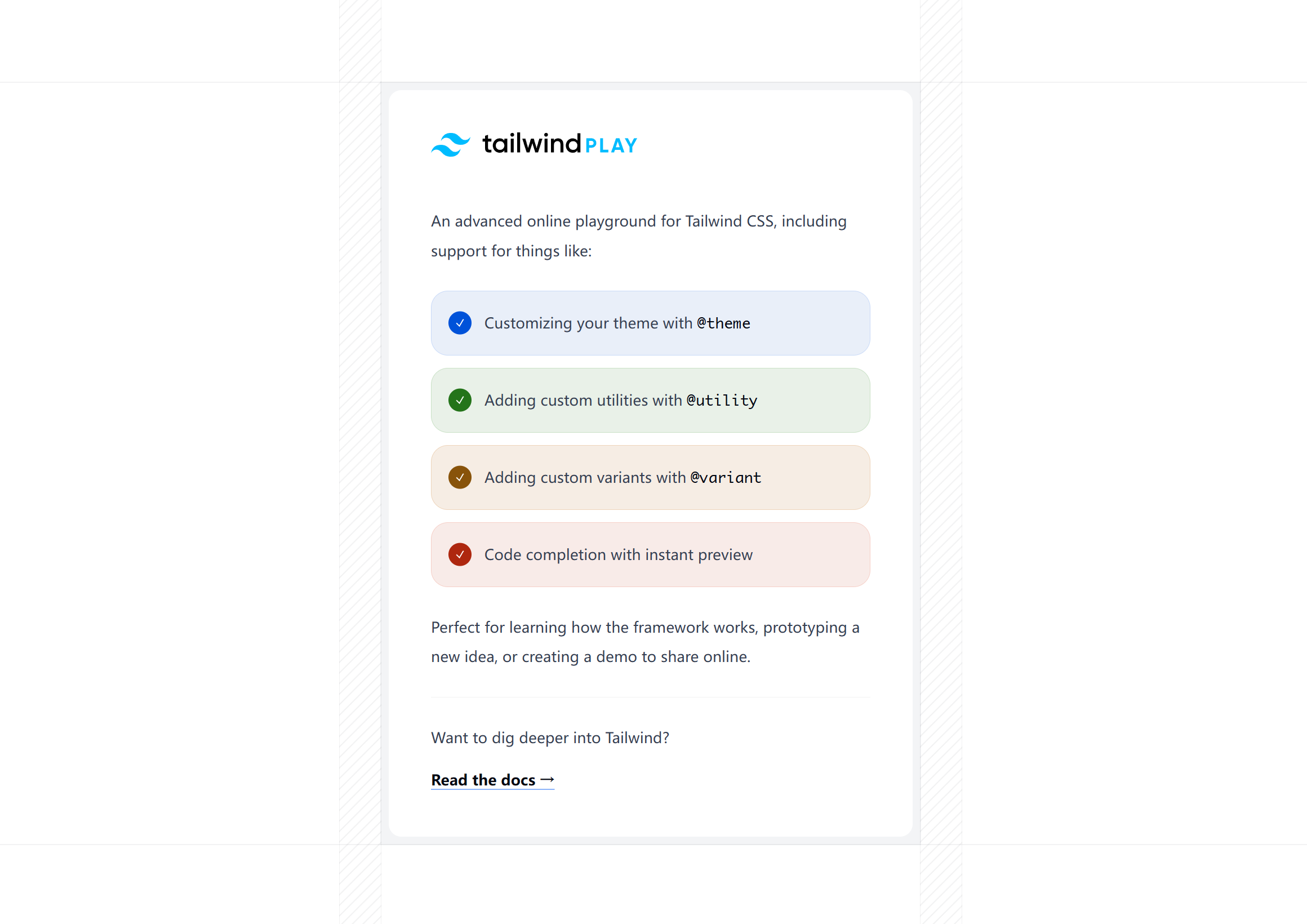
Related Reading
- 色彩空间与色域知识梳理及设计应用 (Sorting Out Knowledge of Color Spaces and Gamuts and Their Design Applications)
- Stripe: Accessible color systems
- Matthew Strom: Generating Color Palettes
- Evil Martians: OKLCH in CSS: why we moved from RGB and HSL
- Björn Ottosson: A perceptual color space for image processing (Oklab)
OKLCH makes color adjustment more systematic while preserving the need for visual judgment. It is useful for generating scales, organizing themes, and working with wide gamut, but gamut mapping, tool conversion, and contrast still need explicit validation. It is not merely a replacement for RGB or HEX; it is a more suitable working space for defining and deriving colors.